
Website design and development
A clearer path from finding a class to booking it.
A thirteen-page website for a London fitness studio, connecting class information and memberships to its existing booking platform.
Discuss a similar project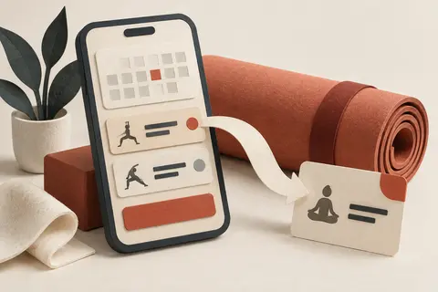
The problem
Visitors need to understand the classes and memberships, then reach the booking service.
What changed
A thirteen-page website connects class information to the existing booking, sign-up and payment platform.
Project scope and tools
Boutique fitness studio, London
- Thirteen-page website
- Design for phones and larger screens
- Existing booking and payment platform
Client name withheld.
Helping visitors choose their next step
The website brings together the studio's timetable, memberships, and class information. The brief covered thirteen pages and the routes visitors take from browsing to booking.
For this kind of website, the class description is only part of the job. A visitor also needs to find the timetable, understand the membership options, and reach the booking service.
What we built
We designed and developed a website for mobile use as well as larger screens. Its pages are generated ahead of time, so the server delivers complete pages to visitors.
Booking, sign-up, and payment journeys connect to the studio's existing platform. The website explains the offer and provides access to those services without creating a separate booking system.
A website connected to the business
The resulting site gives the studio one place to present its classes and memberships, with booking access available throughout the website.
The existing platform continues to handle the transactions. This keeps the website focused on helping visitors find the information they need and take the next step.
Let's talk about your project
Discuss a similar project
Tell Sam what you would like to change. A few sentences are enough to start.
Prefer email?
[email protected]